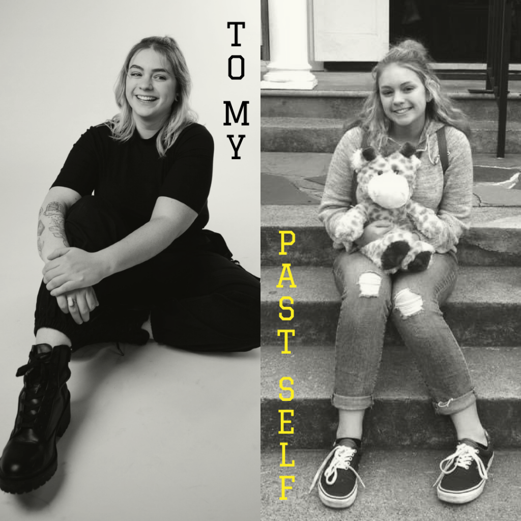
You don’t know this, but you are graduating college and turning 22 in just a few days when you’re writing this (when I’m writing this?) to yourself. You won’t be graduating as an athletic trainer, and you won’t be going on to get your doctorate to be a physical therapist (ESPN isn’t totally out the window, but girl, you’d be shocked by the jobs you’re looking at and working right now). Before sophomore year of college, I would’ve never believed that if you told me, so I can imagine how shocking it must be to hear as a high school junior who has been dedicated to science since 7th grade, taking as many AP and dual-credit college courses as you possibly can. But trust me, it’s for the best! And deep down, I know you’re probably relieved, even just a little bit.
That video effects class you took because you wanted to hangout with your (now ex- for many good reasons) boyfriend during school hours? Take in Every. Single. Moment. That class spoke to you, and you know it. Why did we ignore it?! Get over what your family wants, get over what that boy wants. It won’t make you happy. Do what makes you happy for once. Everything before college doesn’t even matter anymore. Half of the first few years of college don’t even matter anymore! Do things for you!
You will change so much from who you are right now. I will probably change from who I am while writing this. 7 years is a long time. The life you had planned for yourself? Scrap it. Stop living for other people. One thing I’ve learned is to take it a day at a time. Your therapist will tell you that every session- you’ll meet her in about a year, so expect that. She’s pretty cool, honestly.
Life is dynamic and you are meant to be happy. You lived unhappy for a long time, and will unfortunately continue to do so for some time. It’s all experiences, it happened, and nothing I could tell you would make it change. You wouldn’t listen, but that’s also just how life goes. It’s cliche, but good things come out of the bad things, and that’s what makes it worth it, no matter how devastating the bad things seem right now. Whatever you do, don’t stop standing up for yourself and being the stubborn woman you are. I can’t say there were many times we didn’t, but just a reminder. Not everyone will love you, but not everyone needs to love you. The right people will and do.
You’re also surrounded by some of the worst people we’ve met even to this day, so take their words with a grain of salt. They don’t matter anyway. Your friends will almost all come and go. You haven’t even met your soulmate or best friends yet. Hell, I’m still meeting them now. It’ll suck when you lose people you love, but everything does happen for a reason, and you’ll never truly be alone. Love yourself above all else. And your dog. Give him hugs and kisses every day. Please.
You’ll travel to France again, and you’ll go to Costa Rica and Montréal and have the best time ever. We don’t travel too much now- you’ll see why in 2020. Just… wash your hands more and stop sharing your water bottle now while you’re ahead. Take in these experiences, take all the pictures you can. Spend the money on the souvenirs and excursions. You are young, you will make the money back, but you can never get time back. Do the things!
Speaking of money, you need to figure out stocks. I still don’t get it, but one of your good friends is very good at day trading and you should listen to him when he starts blabbering about it. Also, try to get your mother off Facebook. You think it’s funny seeing her learn technology now, but she really turns into a boomer after a while. You should also just delete your accounts, but let me not be a hypocrite in my own letter to myself. Social media is just toxic and not worth it. You know that already, but it’s hard to quit, I know. Maybe in another universe?
Most importantly, stay strong. You have no idea what’s coming. Take it a day at a time, have fun, be yourself. This life is absolutely wild. You’re gonna be fine, kid.
Why are the hotkeys different from software to software? Why won’t you offer a lifetime subscription?
Adobe, I love you, but I also hate you.
My laptop is full of autosave files, yet none of the ones I need. When you crash, I pray. Did I save that? Will the progress I made be there? As I wait for the recovery windows to open, I brace myself.
Why does InDesign do that with my images? You know what I’m talking about. If I wanted it in a frame, I’d put it in a frame. And why must I highlight the text in order to change the color? Who would fill the whole text box with a color? If I wanted a block of color, I’d use the rectangle tool. Why don’t you recognize colors when I copy-paste from Illustrator? Why did my Pantone color suddenly change and now I have 9 different colors that are supposed to be one? And where is your spell check!? I’m human, not a machine like you! I make mistakes- please help me fix them before I embarrass myself (again).
Illustrator- we have a love/hate relationship. You do so much right, but so much wrong. Sometimes, you just don’t make sense. Please, let me resize my graphics without distorting them, I beg of you. What is the difference between the scissor, knife, and slice tools? The fact that I can only use the knife tool, apparently. The perspective tool hurts my brain, Adobe. I just want to put text on a wall, not have a mental breakdown. And why is it so hard to connect two separate lines to form a continuous shape? I selected two points from different lines!
XD, you have my heart in your hands, but I’m so sick of not being able to exit out of desktop preview mode by pressing the escape key. You butcher my graphics from Illustrator, and every time I use the eyedropper, I get a completely different color. But your assets panel is cool, and I can’t lie, it makes my life easier- when I actually remember to use it. Repeat grid saved my life, and your align tools are potentially the best out of all the Adobe programs, but please, let me access typeface glyphs. I need to use the fancy letter, and I can only create an outline of my text and import it from Illustrator so many times. And for the love of all that is holy, please let me link to URLs and not just artboards within my document.
After Effects, I love to hate you. Your keyframes crush my soul, and every time I forget to put a solid under all my layers before exporting to Media Encoder, my life flashes before my eyes. Every other program exports with the artboard as the background unless specified, so why must you be different? And why do I have to write actual pieces of code in order to make my object wiggle or move to the music? Please, make my life easier, not harder. I still love you, though. Kind of.
Photoshop- consider yourself spared. We go way back. I appreciate you for being quick with corrections, but sometimes, you confuse me. Out of all the Adobe programs, I can easily say I enjoy your mobile counterpart the most. Thank you for being (usually) easy and straightforward. Never change.
Adobe, Adobe, what would I do without you? Probably stress less, but isn’t that what being a designer is all about?
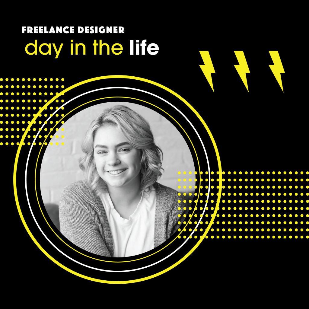
I used to sit in class and think to myself, “I can’t wait to have a real job.” I loved design, and I was ready to be out of school and in the real world. Now that I’m a part-time senior and working in the real world, it’s everything I could’ve hoped and dreamed for! I’m incredibly busy, I’m pushing out content like I never have before, and I’ve applied what I learned to the roles I’m in- and it’s going better than I expected! So, what’s it like being a freelance designer? (If you’re not sure if it’s for you, this is an excellent article on the benefits and downfalls.)
Workload
As a freelance designer, I don’t work a 9-5. I work all the time. I swear, it’s better than it sounds. I work on my own schedule. While I do have an internship that requires me to be in-person, I picked my hours there, too, and work on my clients and projects from my remote job at a marketing agency around that. At my internship, I clock in, work, and clock out. For the rest, I decide when I want to work, and what I want to work on, and record my hours as I go, accounting for breaks and the inevitable ‘oops, I got lost on the internet,’ phases.
Personal Life
As said above, take care of yourself. This means scheduling in time for family, friends, and fun. Your life should not be consumed by your work! Having the freedom of picking your schedule should be liberating, not overbearing. If I have weekend plans, I write a schedule for my week and leave my weekends open. If I have dinner plans, I write a schedule for my week and leave that night open. Planning is key to maintaining a healthy work-life balance. And don’t forget vacations! Even if you’re sitting at home for 3 days or a week, you deserve a break. You don’t need to be in the Bahamas to take a work vacation! Sort out your remaining work and stop taking projects for the time you want off!
Daily Routine
In addition to having the freedom of creating your own schedule, you have the freedom and time to do the things you enjoy. Personally, design is my hobby, as unhealthy as that is, but I love spending time with my friends and being able to watch TV without feeling guilty. This is how a typical day in my life goes:
6:30AM – Wake up!
7:00AM – Actually wake up!
7:30AM- Breakfast and catch up on emails, phone notifications, or watch/read the news. I like to do this sitting outside on my porch with my dog.
8:30AM- Write out my list for the day- what projects I’ll work on and for how long, scheduling in any meetings, any tasks I need to get done outside of work.
9:00AM- Start working. I like to work in hour-long blocks, but sometimes up to 90 minutes, depending on the project. For example, this morning, my first hour was spent finishing a digital portrait commission. I finished 15 minutes early, so instead of waiting for the next hour to roll around for a break, I took one then, and started my next hour block afterward. I then worked on personal branding for my capstone class for an hour. After each hour, I take a 15-minute break.
Lunch- I usually take a 30-minute break between 12:30PM and 2:00PM. If I have things to do around the house, like laundry or grocery shopping, I add that onto my lunch break so I don’t get too far off my schedule.
After lunch- I continue working in blocks until about 4:00PM, when most of my family gets home. They usually are excited to interact since they’ve been at work all day, so I resume my work after dinner if needed. Most days, I won’t go back to my work, since I worked pretty much all day, anyway. But, if I have the motivation, or have an idea, I get back on for a little and make final touches. During busy school weeks, I’ll be on until around 9:00PM some nights, but this is pretty rare.
Bedtime- While I’m 21 years old, in my prime, and youthful as ever, I am not a night owl. I am exhausted way before 10:00PM. I’m usually sleeping by 9:00PM, but sometimes, I can manage to stay up until maybe 11:00PM. When I close my laptop for the day, work closes with it. The few hours I have at night are for me! So, I spend some time on my phone or watching TV or hanging out with my family or boyfriend before going to bed. Resist the urge to check your emails! There is no such thing as a design emergency– it can and will wait.
Recap
That’s pretty much it! I hope this was helpful. Here are some bonus links to help you manage your time effectively and survive the freelance life:
Graphic design has evolved with technology. It dates as far back as the 1400s, but really evolved with the inventions of the screen press, color printing, and, of course, the computer. According to 99designs, “book designer William Addison Dwiggins first used the term ‘graphic design’ to describe exactly what his role was in structuring and managing the visuals in book design, (Matt Ellis, 2018).” Others, such as Paul Rand, would go on to further tell the world what is it we do as designers. But, as time passes, we fall deeper into this digital world, and the designers of the 90s couldn’t have begun to think of the possibilities design possesses today.
Adobe Photoshop—first released in 1990—even on its own changed the face of graphic design. Photo manipulation created a whole new subcategory of graphic design, blending together elements of photography, illustration, and CGI.
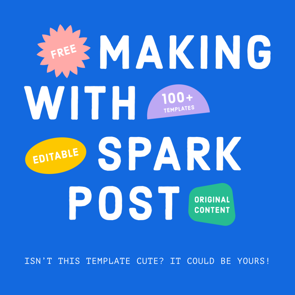
The designer tool belt of today has a suite of Adobe programs (and a laundry list of alternatives) that have come a long way since the launch of Photoshop in 1990. With endless ways to create, design is quite literally at our fingertips- and as much as I despise watching $30 come out of my bank account every month, Adobe continues to make my life easier, especially with Spark Post.
What is Spark Post?
Adobe Spark Post is an (free! mostly!) Adobe program available on mobile and desktop used to create graphics, mainly for social media. Similar to Canva, Spark Post has pre-made templates and tutorials on all their tips, tricks, and features. While I don’t personally use these pre-made templates (other than for the adorable header image I used here!), they can be super helpful for gathering inspiration and finding new assets, and if you do use them, kudos to you! Templates are aren’t inherently bad- they are fast, beautiful, and easy to use! But what made me love Spark Post was the ability for me to make social posts on-the-go with my own content.
Creating With Spark Post
From moodboards to video cover photos to quick graphics, Spark Post has been with me since the start of my graphic design journey. When I first realized I wanted to do design, I didn’t have an Adobe subscription yet, but I wanted to practice and start learning the programs. Spark Post was advertised as a free app for creating graphics, so I downloaded it along with several others, including Canva, Over, Adobe Draw, and Photoshop Mix. I used the Sharpen.design site to generate some prompts and got creating (prompts are super helpful and a great way to practice without having any clients- read more about how I built my portfolio with ZERO clients using design challenges and prompts here!).
Spark Post immediately had my heart. It was easy to use, had a giant library of free fonts and icons, and gave me a lot of creative freedom for a mobile application. Even today, I use Spark Post for social posts at my internship, and the app has grown greatly since I first started using it. Features are being added with each update, and there’s even a Facebook group made by Adobe for Spark Post users!
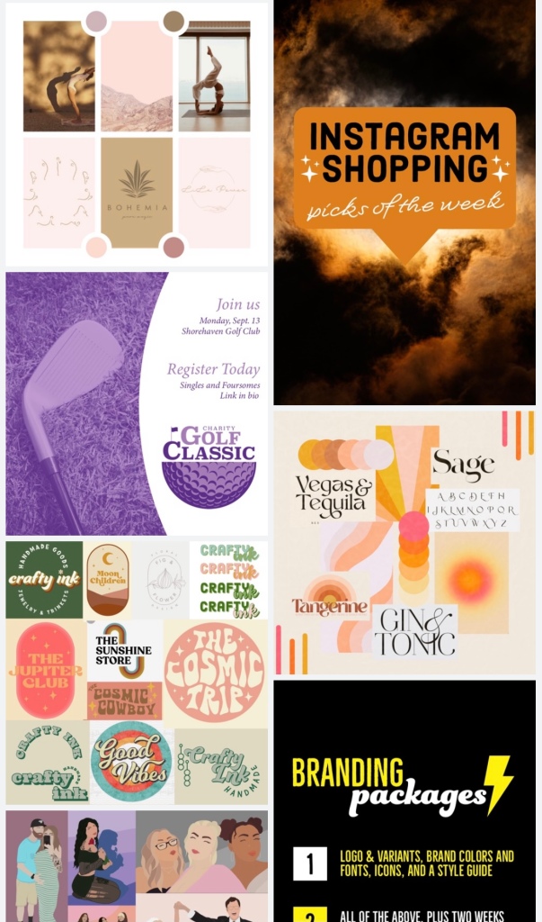
Examples of what I create with Spark Post (moodboards, video covers, social posts, stories, collages)
Adobe also has Spark Video and Spark Page, which are both highly rated in the app store. Spark Video allows creators to make and edit videos with ease and cleanliness. Spark Page allows creators to make simple, yet stunning, webpages and presentations.
The possibilities are endless when using Spark Post. There are so many uses and it is incredibly easy to use. You can even pick up on your desktop where you left off on your phone! Whether you choose to upgrade or use the free version, the Adobe Spark suite is an excellent tool for designers with tons of features and content readily available!
Think of your favorite brand. Adidas, Nike, McDonald’s, Disney- whatever it is, picture their logo. As a brand, it’s important to market effectively, which usually means spending a nice chunk of money hiring a designer (or a team of designers) to create their look. How do these graphic designers land high-budget projects? By being great designers! And what do great graphic designers do? They hate logos.
What is a logo?
A logo is a visual representation of a brand. It is what people see on the sign out front or on the business card included in the package you just sent out. A logo can be made of type, graphics, or a combination of both. Not all logos are created equally- there are some not-so-good logos out there, and not every brand will see the worth in paying a higher budget graphic designer with vast experience and proven results, versus a lower budget graphic designer, with little consideration of their experience level.
“A good logo shows what a company does and what the brand values. Logo design is all about creating the perfect visual brand mark for a company.”
When creating and marketing your brand, the last place you should be cutting corners is with branding. So many household brands are recognized for their logos. People need no information to know what that logo stands for.
If logos are so important, why do graphic designers hate them?
Logos vs Branding by Katie Proctor of Wildflower Design Co.
Branding. Every brand should have more than just a logo. It’s called branding for a reason! You need assets! You need consistency! You need to identify your brands’ visual identity and apply it across the board.
“Your brand identity is what makes you instantly recognizable to your customers. Your audience will associate your brand identity with your product or service, and that identity is what forges the connection between you and your customers, builds customer loyalty, and determines how your customers will perceive your brand.”
The reason companies invest in graphic designers is because it’s worth it. We spend our lives researching trends in user experience, aesthetics, and design. And while not all graphic designers do branding design, similar to how not all graphic designers do illustration or web design, investing in graphic design for something like social media or animation, and having them work from a style guide created by a branding designer, you are further conveying your brands’ message consistently. Big brands, such as Pepsi, for example, may seem like just a logo and clever photography, but there’s so much more to it. You can see Pepsi’s entire brand style guide and rulebook here. Don’t like Pepsi? Here’s Oreo, Target, Toyota, and Dunkin’ Donuts. There are guidelines that must be followed, and clearly, they’re working!
What now?
As a designer… Whether you’re a beginner or already an experienced brand designer, if you want to be a brand designer, study brand style guides and do your research. Offer branding packages, and back them up with knowledge. As designers, we take jobs that we don’t necessarily love, but need the experience. If someone is adamant about getting just a logo, and you’re at a point where you want to do it for the experience, that’s okay! Not every client is a dream client, and not every client can afford a full branding suite right off the bat. Doing a logo for them builds rapport, potentially scoring you some more work down the line, and now you have some experience under your belt. It’s entirely up to you as a designer to pick and choose your work. Do what you want, pass on what you don’t!
As a brand… Consider investing in a graphic or branding designer! Visual identity is so important to every brand, whether you’re a one-person show or a team of thousands, and there are designers for every budget. Do your research, find someone reliable, and ask yourself the following questions when you do decide to move forward with a designer:
Who is your ideal customer?
What pain points do you (the brand) solve?
What kind of personality do you have?
Who is your competition? What sets you apart?
Why do your clients trust you?
What is your story?
What are several words to describe you?
What brands do you like? What brands do you not like?
What is your brand/audience language?
What platforms will you use?
What will you need? (packaging, labels, backdrops, signage, website, etc.)
How will you test audience reception?
“Without a well-crafted and maintained brand identity, your marketing will always feel flat and one-dimensional.”
So, you’re a graphic designer. Whether you’re a student, just getting into design as a hobby, or a seasoned professional, congratulations! Graphic design is a great way to express yourself creatively – and make some money! But how will people know you’re good? How do you even get good as a beginner?
I switched my major from sports medicine to graphic design going into my junior year of college. I had little to no graphic design experience other than doodles in my sketchbook, about 100 Pinterest boards filled with ideas, and some school projects, but after researching careers the entirety of the previous semester, I decided I wanted to become a graphic designer. Boy, do I wish I knew what I know now! All over the internet, there are incredible resources to help you (yes, you!) build your portfolio with absolutely no clients. Here, I’ll share some of my favorites.
Design Challenges
One of the first things I did over the summer before my first semester was the LogoCore 30-day design challenge. The company emails you a brief every day for 30 days, and your job is to create a logo. This challenge is one of the better known graphic design challenges, and you can find a ton of entries for inspiration here and here.
Similar to the LogoCore challenge, The Daily Logo Challenge and Daily UI also offer prompts straight to your email. The latter differs in that the prompts have you build out different pages to a website or app instead of logos, which is great for anyone interested in getting into website or UX/UI design. Having a portfolio that shows you’re a well-rounded graphic designer will make you stand out amongst the competition!
Another great way to find challenges is to search for them on social media. There are a ton of graphic designers out there offering their own challenges. Some are for fun, some have winners, but the important part is that you got to design something of substance to present. You can do some research and find weekly, or even daily, prompts, but here are two of my current favorites:
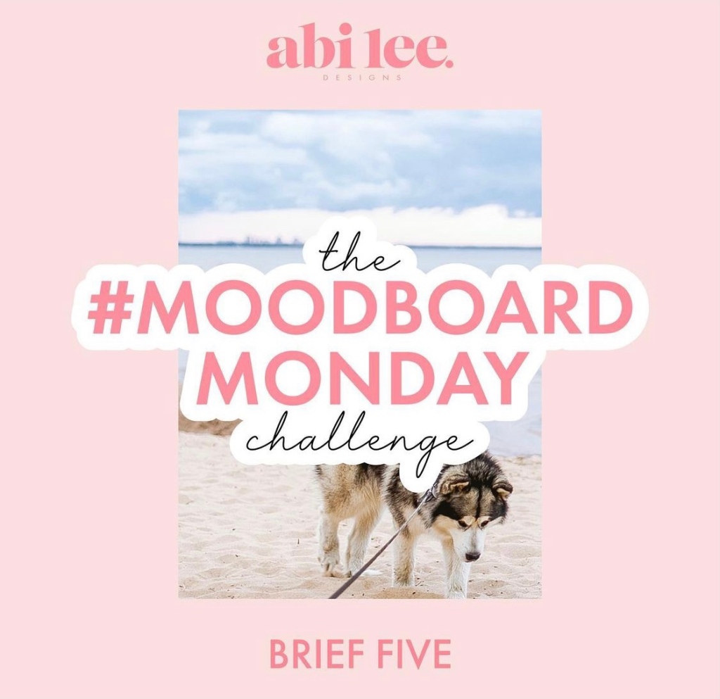
@AbiLeeDesigns #MoodboardMondayChallenge
Abi is a very talented graphic designer and illustrator that gets designers’ creative juices flowing with fun prompts every two weeks. The prompts give a general ‘vibe,’ and the rest is up to you! Some designers have ever made passion projects out of these prompts (myself included, but that’s a work in progress). A winner is selected on the Sunday before the next prompt comes out, but it’s really all about having fun and creating!
In addition to getting these awesome prompts, you also get to see the amazing work she does for her clients, which is inspirational in itself!
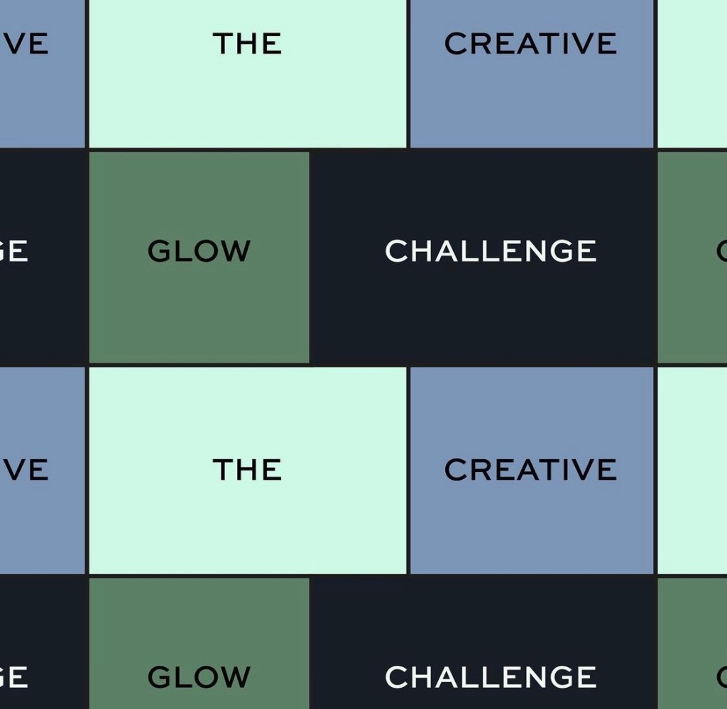
Another Abi! Abi Design is a brand designer based in the UK. Her Creative Glow Challenge is one of my current favorites going around!
Every Monday, a new prompt is posted, and designers have until the following Monday to submit their take on the prompts. Abi then picks her top 4 designs and her followers vote on the winner! Each challenge has a totally different theme with different requirements, so it’s super fun to see where each prompt takes you! The particular prompt going on during the time of publication of this article gives you freedom in choosing a name, but restricts you to one color.
Completing challenges like these is not only beneficial in the long run to see your growth as a graphic designer, but it gives you content to market to your future potential clients! Everyone has to start somewhere!
Prompts
Similar to the challenges above, some accounts offer prompts to inspire designers. There are also websites that specialize in randomly generating prompts, which is great for when you’ve exhausted all other prompts or want to try something new.
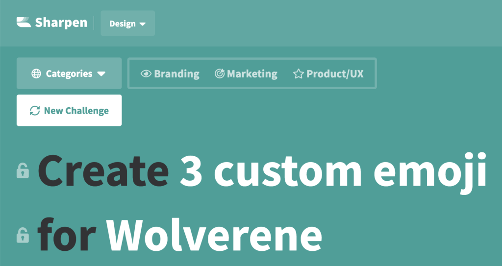
Sharpen.design
A personal favorite of mine is the website Sharpen.design. They allow graphic designers and other creatives to choose between design prompts, marketing prompts, and UX/UI prompts. You can also lock the deliverable or the client and continue refreshing for a new prompt until you find one you like. I have used this site plenty of times when I had no work to do or was in a creative rut. The prompts can be as small as designing a few icons or picking a color scheme to as complex as a full style guide or packaging. You really have a lot of freedom with these prompts, which is part of why I love them so much!
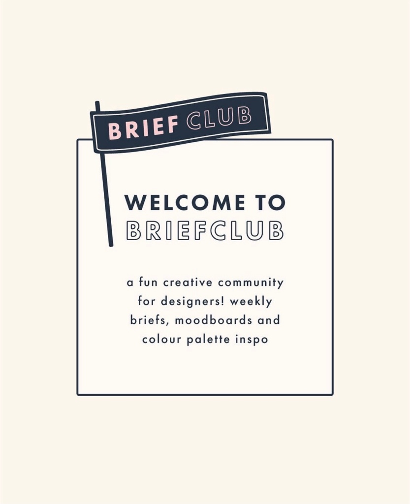
@BriefClub by @NatalieGollop
Natalie Gollop created briefs for her own passion project before deciding to start Brief Club. Every Monday, a new brief is posted. Each brief contains a brand name, what they do/sell, and what they need. The rest is up to you! Winners are chosen for each prompt, but she has also asked her followers to help decide on winners from time to time.
In addition to these great prompts, Natalie also posts some helpful tips and is extremely involved with her followers. She also participates in her own prompts and posts her designs to her personal page.
Katie Proctor is the fearless leader of Wildflower Design Co. When you sign up for their Brand Bootcamp, you will receive emails every week with different prompts and deliverables. You can do as much or as little as you’d like, but they give you general guidelines to get the creativity going.
Wildflower Design Co. is an inspiring and helpful account for beginners. Katie gives a ton of tips through reels and is very involved with her followers.
You can follow Wildflower Design Co. on Instagram here. She also has a Facebook group for graphic designers to share tips and get to know each other!
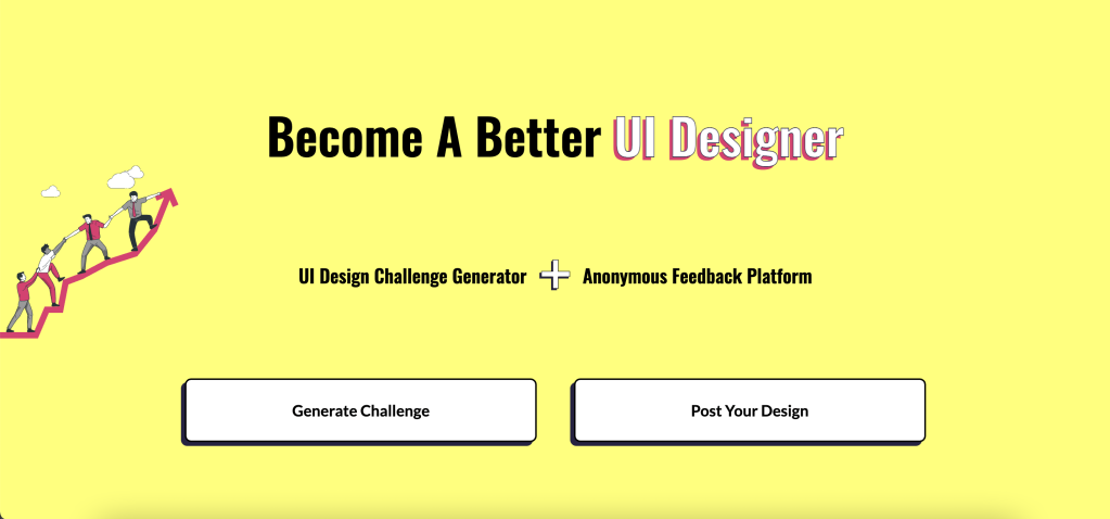
UI Coach
UI Coach is a website that generates briefs for UI designers. Each brief has a description of what is needed, a color palette, a type pairing, and a kit for illustrations (which is really awesome and sets it apart in my opinion!). You have the option of designing in WebFlow and sharing your design directly from there, or designing in your program of choice and submitting later.
I think UI Coach is an amazing site for graphic designers focused on UI design, and it allows more freedom and less time constraints than the Daily UI challenge since it’s self-paced and you can do however many you want, whenever you want, but both are great resources to build your UX/UI portfolio.
Prompts are a great way to get inspiration for projects to fill out your portfolio, and can even turn into passion projects, which I will discuss below.
Passion Projects
Passion projects can come from prompts or can be created by the designer. The whole point is to act like you are designing for a real brand and present it as such.
Natalie Trinidad, a graphic and brand designer, says in her blog post covering passion projects, “Passion projects are great places to show your potential clients or audience what you are capable of and the skills that you have. But I also think that it’s a way that you can continue to sharpen your skills. You have the opportunity to keep improving your skills by creating more passion projects and each time you can keep track of how you have improved.” You don’t need clients to show the world what you can do. By showing your skill, the clients will come to you. Real brand or not, good work doesn’t go unnoticed.
While I have a few passion projects in the works, I have yet to finish them between my hectic schedule with classes, work, and life in general. Here are a couple of my favorite passion projects from fellow designers:
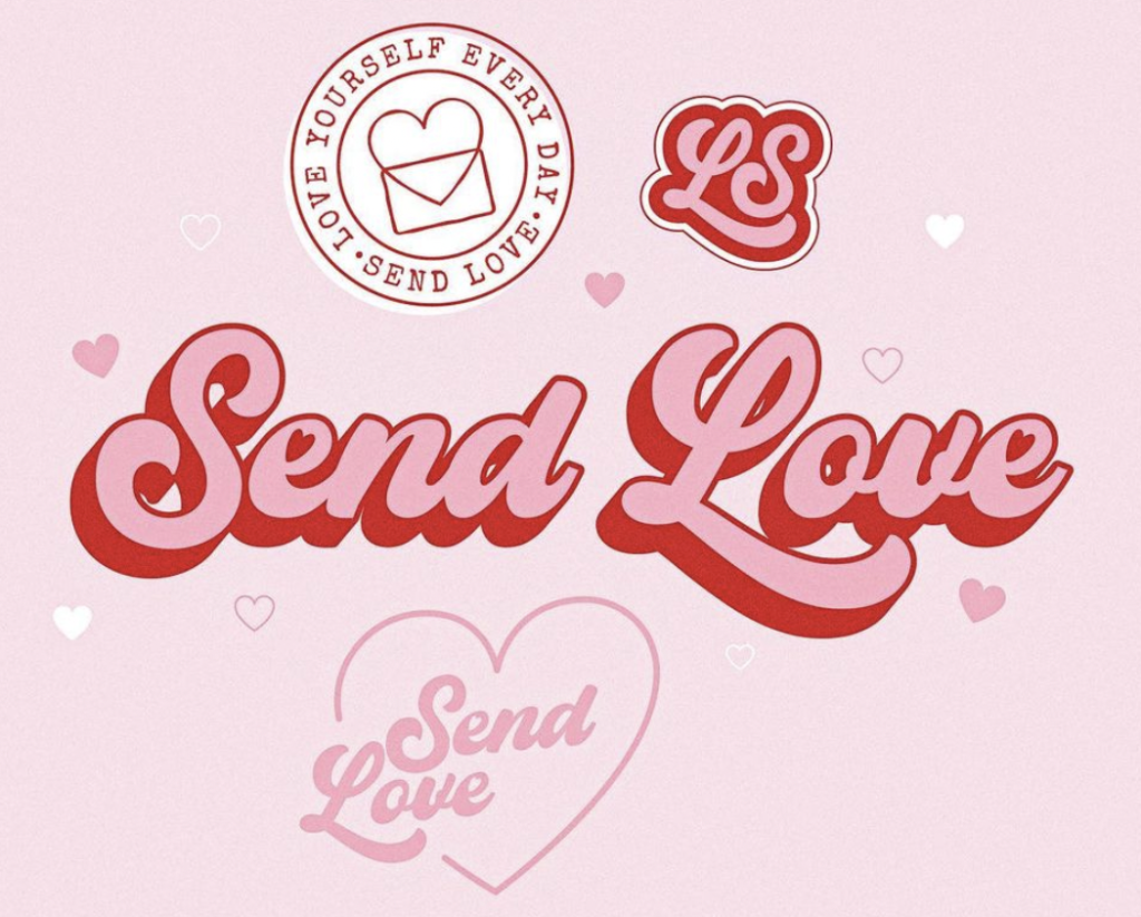
Send Love by @AugusteDesign
I stumbled upon Auguste on Instagram Reel one day when she posted the beautiful work she did for Santa Breeze Beach House in Florida. This project absolutely blew me away. So, when she posted this reel of a recent passion project, I instantly fell in love.
This project is a great example of what a passion project can do for you. Not only is this particular design fun and cute, it’s clean and professional and can now be used to showcase her talents as a designer.
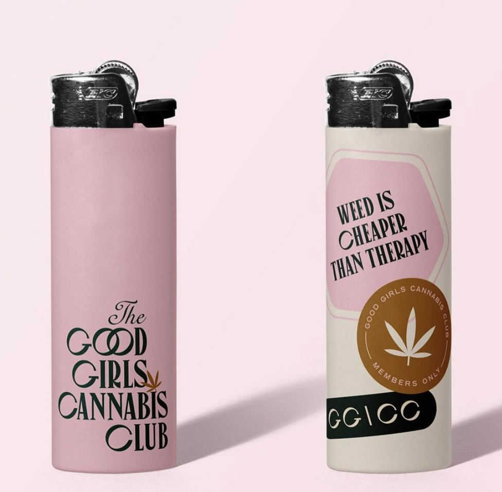
The Good Girls Cannabis Club by @TheBemusedStudio
Lauren is a branding designer and leader of Bemused Studio. This passion project is one of my favorites because it combines a ‘controversial’ topic with excellent branding. The sticker-like branding is a huge trend right now and rightfully so! It’s just so darn cute.
Passion projects that allow graphic designers to show their strengths are incredibly important. Lauren has grown a lot as a designer and has even come back to this project to see how she can take it to the next level. Projects are never-ending, and reworking something old can make a great portfolio piece an even better one!
Mockups
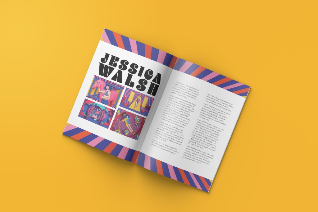
A type spread about Jessica Walsh I did for classwork that I turned into a portfolio piece using a mockup.
If you already have some work, whether it’s from clients, school, or of your own accord, a great way to make your portfolio stand out is to use mockups. Using mockups can even help you create more content for your portfolio. There are lots of resources out there, but there most recommended sites to find mockups are Yellow Images, Mockup World, Mr. Mockup, and Graphic Burger. You can also search for mockups on Behance and Dribbble.
I personally love mockups as they make the design even more exciting by showing what it would look like in real life. As graphic designers, we don’t always get to see our work physically or have the means to get it done just for a photoshoot. Mockups can add so much value to your work.
Class Work
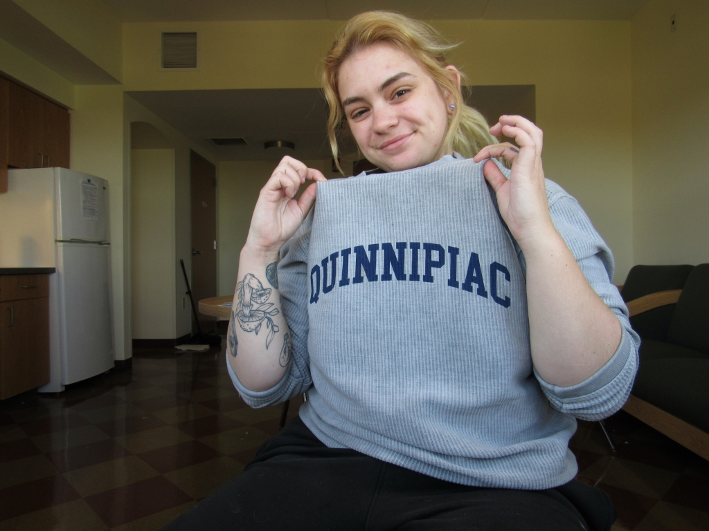
A class project I did for Web Design II at Quinnipiac University in 2020.
And finally, class projects. If you’re a graphic design student, you’ll have a decent amount of work. If not, you can utilize design prompts and challenges to fill in this area, or even invest in an online course that includes projects or prompts.
Class work is usually the foundation of portfolios for designers entering the business world after college. Strong class work can make or break your chances of landing a job because these projects are often extremely detailed and time-consuming. Documenting your process is also helpful as it serves as additional content and gives potential clients and employers some insight into your creative process as a graphic designer.
Designers will often keep their favorite pieces from college in their portfolio for years, because not only is it more content, it shows progress. Your first project will be nowhere near as good as your newest, and that’s okay! We grow as designers and people every day- be proud of yourself and your work!
Recap
There are tons of great resources for graphic designers across the internet and in our libraries and bookstores. Inspiration is all around us. As a graphic design student, it’s incredibly important to showcase your work and advertise yourself properly. If you’re not quite to the point where you have steady clients, or you’re just in a dry spell, there are plenty of opportunities to expand on your portfolio and develop your brand as a professional.
As I near the finish line to get my degree, I have a lot to do in the coming weeks. While I’m finishing projects, creating my brand, and applying for jobs, I am reflecting on my graphic design career and hoping to share the things I wish I knew back when I first began. I hope that someone, somewhere, can relate and use my experience to their advantage. We are all in this together, people!
As I packed up my dorm for the last time, I couldn’t help but reminisce with my suite mates and friends from over the years. While they’d be walking the stage and getting their degrees, I would be staying behind for another semester at Quinnipiac. In the fall, I’ll be wrapping up my degree requirements with three classes- a continuation of each typography and web design, and portfolio. Switching majors as I entered junior year of college guaranteed I wouldn’t graduate on time; however, I was fortunate enough to power through most of my requirements and landed myself with a single, part-time semester tacked on to my 4 years of college. While I’m excited for the final classes to begin, I have a summer of work ahead of me, and more importantly, I’m beginning my career as a graphic designer.
From January to May, I spent hours applying to internships. I read dozens of postings and lists of requirements. I threw resumes and cover letters together for any and every company I could. Just as a regular job search goes, looking for an internship was no easy task. There’s tons of qualified students out there, and being over an hour away from major design hotspots, options are pretty limited when you have to keep your responsibilities in mind. Luckily, I heard back from a local non-profit, and from the first interview, I knew I had found the internship. After two interviews and a briefing, I was hired as a graphic design intern. I also accepted a summer position at my school, continuing the role I have worked for the past 3 years. Between 12 hours of interning a week and 24 hours of answering phones and running errands, life hasn’t slowed down since I wrapped up finals.
Currently, I’m working on building comps for a mobile app, creating social media posts, and sifting through pre-existing material to get some ideas. I’m also still taking commission work, and just wrapped up an awesome project for a candlemaker. This summer will surely be a busy one, but it’s all for the future, and I can’t wait to share the ideas I come up with.
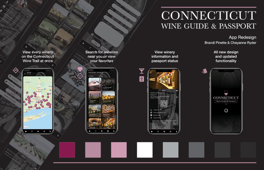
After weeks of hard work, I’m excited to share the ‘final’ product of the mobile application redesign my partner, Cheyanne Ryder, and I did for our mobile interaction design final. Above you’ll find a link to download the process book, showing in-depth how we got from an idea to a fully-functional prototype. There’s also a link to try out the prototype. While no design is ever finished, and I’m sure we’ll both be going back and making edits in the future, this is the result of hard work on a deadline with a vision in mind, and we’re extremely proud of ourselves and each other for what we’ve accomplished this semester.
We had a ton of fun making this app. We had similar visions for features and design from the start, so we took extra time with our user research in order to gather accurate and meaningful data in which we would build our app from. While the does app exist, it’s very basic, consisting of a defunct profile page, a rulebook, and a passport check in screen, and it is not user friendly. The ‘passport’ is outdated, there is no relevant information on wineries, and competitors have more features, displayed beautifully. This ‘ugly app’ was the perfect candidate to overhaul. We studied the top apps for wine trails and wine pairings, conducted user testing, and researched layouts, navigation, color schemes, and more. After countless hours of research, designing, redesigning, adjusting, readjusting, editing, prototyping, and testing, the Connecticut Wine Guide & Passport app redesign has been a success. We couldn’t be more thrilled to present this work, and we hope you enjoy it as much as we do.
This week (04/11/2021 – 04/17/2021), my partner and I worked to design separate design comps and come up with one cohesive design. We encountered some setbacks, but we’re still combining ideas and working towards the final design!
Visual Research
As always, I have to include my favorite part. Visual research can start at any point in the design process, but here is where it really shines. Making good color and font choices can make or break a design, and color should always be purposeful. You have to ask: what mood, message, or vibe do I want this product to convey? How can I effectively portray this mood, message, or vibe so the user has the best experience while the product is aesthetically pleasing? Pinterest, Dribbble, Behance, and Instagram are all great sites to use when looking for inspiration. You might even stumble upon a great UI kit that you can use for comping. Copying other artists can be tricky, but the rule of thumb is to make it your own and never outright steal a design. “Nothing is completely original — every new idea is very often just a remix of one or more previously used ideas, (Dawid Tomczyk for UX Collective).” Trying out different designs will allow you to eliminate aspects you don’t love and incorporate the good aspects into one design. Go outside your comfort zone! You never know what combination of fonts, colors, and shapes could speak to you.
User Interface Design
User interface design should reflect the desired user experience. Wireframes should come to life and begin to take on an identity of their own. What is UI? UXPlanet defines it, saying, “it consists of the buttons users click on, the text they read, the images, sliders, text entry fields, and all the rest of the items the user interacts with. This includes screen layout, transitions, interface animations and every single micro-interaction. Any sort of visual element, interaction, or animation must all be designed.” So, a design, right? Partially. Research and practice are needed in order to find the right fit. If you’re reading this and putting it into practice, you likely already know the major do’s and don’ts, but if you don’t, here’s a few: never use Comic Sans, don’t use light text on a light background, light doesn’t have multiple sources, and ALWAYS take advantage of white space. Tried and true designs are tried and true for a reason. Get outside your comfort zone, but don’t go overboard and lose your vision. Some things are just meant to be! Share your work, get some feedback, talk to mentors or peers or target users. Everything you design has a purpose, and it’s all about the user experience.
Recap
As we finish our design, we’ll begin to prototype and finalize our choices. We’re excited to see where this project will go! As I near the end of this semester and prepare for my final semester as an undergraduate, I’m excited for the work I will be doing with a local non-profit and in class. I’ll continue to update with some projects and insights in the near future. Good luck and stay safe, everyone!
This week (04/04/2021 – 04/10/2021) my project partner and I built out our information architecture and wireframes for our Connecticut Wine Guide & Passport app redesign/recreation. I outlined this process when I was redesigning another app here, but I’ll go into more depth with this post.
Information Architecture
Information architecture is incredibly important when beginning to design a website or app. Organizing everything you want in the app and showing how users can navigate to and from pages will give you an idea of how many screens you need and what kind of menu or options to include in the design. “Information architecture is the practice of deciding how to arrange the parts of something to be understandable (…) visual elements, functionality, interaction, and navigation are built according to the information architecture principles. The thing is that even compelling content elements and powerful UI design can fail without appropriate IA, (Information Architecture. Basics for Designers by tubik for UX Planet).” Without information architecture, designing a site would be pretty difficult in terms of knowing what you need. Changes would occur more often than if you had a plan (aka, the information architecture), so just do it! Consider your audience and what they’ll be using the site or app for, and starting planning. Remember to use a user centered approach. Information architecture could be the piece that sets your product apart from the rest, and while it takes time and resources, it’s going to make a real difference in the final product and reception. You could make your IA using some pretty simple programs or websites, anything that can make a flowchart or boxes and arrows will do. I’ve used Illustrator and draw.io personally (draw.io is free!), but I’ve heard good things about FlowMapp and some classmates have done theirs in XD. Information architecture should include the home page, branching off to your ‘main’ pages and pages directly attached to the home page. From there, each page should have branches to the pages directly attached to them, until everything you want to include is there. Be thorough, look back to the target user, and keep it clean.
Wireframes
Wireframes go hand in hand with information architecture. Sometimes, the steps are combined and wireframes are used in place of blocks with a label in information architecture. Wireframes are low-fidelity drafts of the basic layout and organization of an individual page or screen. According to inVision, the purpose of wireframes is to present the information that will be displayed on the page, create an outline of structure and layout of the page, and convey the overall direction and description of the user interface. While most wireframes aren’t super detailed and contain very minimal, if any, visual design elements, they set the scene for that content to be used in the best way by outlining the necessary elements and working the rest in around it. Rosie Allabarton of CareerFoundry suggests asking yourself these questions when creating wireframes: “How can you organise the content to support your users’ goals? Which information should be most prominent? Where should your main message go? What should the user see first when arriving at the page? What will the user expect to see on certain areas of the page? Which buttons or touch points does the user need to complete the desired actions?” Is what you’re creating useful and usable? Remember to maintain the user centered approach. Focus on aesthetics later, and build out your pages!
Recap
Next week, we’ll be working on our design comps and collaborating to make one final design. We have some ideas in mind, but it’ll be great to see them finally come to life. I’ll be back to talk about user interfaces and how to build a brand. Until then, happy designing!