Feeling Out Your Audience: Empathy Mapping and The Persona Project

GID315, Mobile UX/UI

This week (03/28/2021 – 04/03/2021) I spent my time building my process book and analyzing data from a survey my partner and I sent out. I also got to create some personas- one of my favorite parts about the research portion of design! If you want to brush up on the basics, you can backtrack to this post I made earlier in the semester, where I talked about user interviews, competitive analysis, personas, and empathy maps. Today, we’re going to dive right in and dissect empathy maps and how to build personas.

Empathy Mapping

Empathy maps are extremely useful when designing a product or service. Why? “As UX professionals, it is our job to advocate on behalf of the user. However, in order to do it, not only must we deeply understand our users, but we must also help our colleagues understand them and prioritize their needs, (Gibbons, 2018).” Empathy maps allow us to visualize what we need to know about users. Empathy maps can differ from designer to designer, but the overall point remains the same: learn about the user so we can make changes accordingly. 

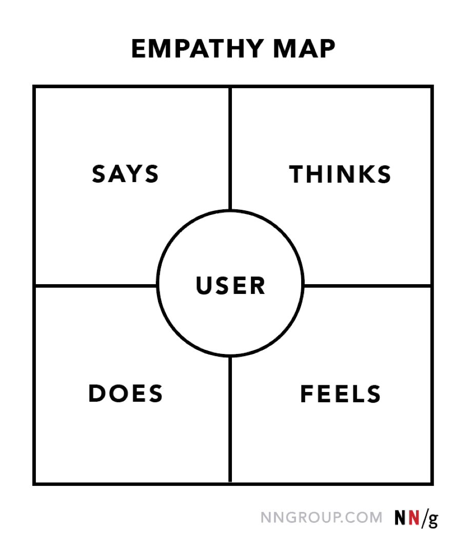
The two empathy map templates above show how certain maps can differ, as well as how they can be similar. While one has ‘observations’ and ‘needs’, another has ‘says’ and ‘does’. The first template also has a ‘problems’ and ‘solutions’ area, which is usually included along with any empathy map, whether or not it is on the template. Some maps have ‘hear’ and ‘see’ sections, as well. It all boils down to preference and deciding what information will assist you. You could include them all if you wanted! I usually stick with the following: says/thinks, actions, feelings, and observations. I always have ‘pains’ and ‘gains’ (‘problems’ and ‘solutions’) on the side of each map. It can be extremely hard to fill these out when beginning, but with user interviews and research, the map will begin to fill itself (well, you still need to fill it out yourself, but you’ll be getting tons of information from your users that makes it super easy to finish!). Regardless of what options you use for your quadrants, here are some helpful tips to aid in completing your empathy maps (Gibbons, 2018):

  • Says: what the user says out loud; can be verbatim or direct quotes. Pay attention to what your user asks, states, and expresses! This part is pretty simple, as it’s right in front of you, so just be sure to listen closely and engage the user. Says can also be combined with…
  • Thinks: what the user is thinking. This can be hard, as you’re not in the user’s head. But pay attention to their answers to questions and actions! What does the user need? What matters to them? I personally combine ‘says’ and ‘thinks’ as they can overlap, and I like to get as much information as possible, so adding another category into my quadrants is (personally) very helpful. This is all up to you! Whatever works best and allows you to understand the user to the fullest potential is what you should go with. Everyone designs differently!
  • Does/Actions: this option is best for user testing experiences. What is the user doing? If you’re showing them a webpage, write down how they navigate it, and what they’re trying to do even if the page isn’t responding the way they’d like/expect it to. Screen recording (or even just videotaping) can be very helpful with user interviews, especially for this category. I take into consideration what the user does daily that could be related to the product. For our vineyard guide app, I asked questions about their frequency of drinking and if they often go to wineries and included this data in my empathy maps. “The user drinks 3-4 times a week,” or “the user goes to wineries often,” can both be included under ‘does’ or ‘actions.’ 
  • Feelings/Feels: how is the user feeling about the product or line of questioning? Sometimes they will express this verbally, and others they will not. Pay attention to how the user is reacting. You can also clarify the feelings you record with a brief sentence summary. With the existing winery app, users were greatly pained with the profile aspect, so I wrote: “frustrated: unable to create/save profile.” A few users were unable to see their wine passports and did not like that they couldn’t see the wineries they’ve been to, even when they’ve ‘stamped’ their passports. I wrote: “confused: winery history unavailable, passport does not track.” 
  • Observations: this category is used often in empathy maps and combines ‘sees’ and ‘hears,’ which can be found on other empathy map templates. This one, like ‘says,’ is pretty straightforward. What is the user seeing? What is the user hearing? Sometimes, depending on how your user interviews are being conducted and the nature of your product, smell, taste, and touch can be involved, as well. You can ask questions about the senses to get a better read on your user if you are not sure what they are observing. Interview questions are not set in stone!

I personally don’t include ‘needs’ on my main map as I usually include them in the ‘pains and gains’ areas. ‘Pains’ describe the pain points (problems, issues) of the user experience, while ‘gains’ describe what the app is doing well or how to improve it (solutions, ideas). If a user’s needs are not being met, I write down what they need in the ‘gains’ area as a solution, and why it’s not being met in the ‘pains’ area. However, if you choose to include needs on your main map, take into consideration the feedback given by the user. What did they want from the app? Why did they want it? Is it relative? Should it be there? Is it a product issue, or just simply excluded?

Personas

With an empathy map (or better yet, maps, unless you do an aggregated map with input from multiple users), we can begin to build our personas. Personas depict the target audience What traits would the user have? Why would the user use our product or service? There are tons of templates out there for personas, so you can browse around and pick one or create your own! You can customize your ‘template’ to include relevant information. In the case of the winery app, I included their ‘ratings’ of different alcoholic beverages to show what they prefer. Later, when creating wireframes, I’ll work this preference into a search filter result, so users can find wineries that serve drinks other than wine that they may prefer. But for now, let’s focus on personas!

Using the data from your user research and the empathy map(s) you just made, you’ll begin to construct your persona(s). Most projects require more than one. Arthur McCay from UXPressia says, “It is important to keep in mind that a persona is a collective image of a segment of your target audience. It cannot be the face of the entire TA. Nor can it be just one person. You need somewhat of a golden middle.” In an article that McCay references, ‘How Many Personas Should You Have?’ by Yuri Vedenin, the founder of UXPressia, Vedenin states, “what you should end up with is a certain number of customer subgroups each of which has a set of traits and characteristics that unite them.” No audience is the same, and if you’re targeting some contrasting or broad groups, one persona will not be able to encompass everything. Sit down and analyze your data and take into consideration who you want as your audience and who is going to be your audience. People who frequent wineries will likely be an audience for the app I’m redesigning, but I also want people who like wine and haven’t been to a winery to use the app. When building my personas, I had to think about how to represent each group of people.

It can be hard to choose what to include and keep out of your personas. To start with the basics, most personas include demographic information, goals, motivations, and pain points or frustrations. Name your persona, add a biography or description, and maybe even add a photo. From there, it’s pretty much up to you! What brings each group of your audience in? Again, why would the user use your product or service? What qualities translate over? There’s plenty of resources available to get inspiration from, even if it’s just one thing from one template and one thing from another. Get creative!

Recap

This upcoming week, I’ll be focusing on information architecture. My project partner and I will be sharing our empathy maps and personas and combining what we have to further enhance the user experience. We’ll begin talking about app choices and what we want to include, making the information architecture, and sketching wireframes. The creative process never ends!

Building a Background: Competitor Analysis and User Research

GID315, Mobile UX/UI

Welcome back (or welcome in general)! This week (03/21/2021 – 03/28/2021), I started a new project: overhauling a winery guide app. Since we’ve been through these steps already (and I doubt you want to read the same thing twice), let’s get specific.

Competitor Analysis

You have an idea. Great! How many people have had this idea? The first thing you should be doing with your idea is researching it. Compare your product to others in the field: what makes them great? What needs improvement? Who is using it and why? What are the users saying? What have the developers/producers done? In the case of UX/UI design, seeking out the competition is quite simple. Ratings and reviews are helpful to both potential users and developers. A quick google search or a trip to the app store can unearth all you need to know about what’s out there. Maybe there’s a feature you’ve been thinking about including, but you’re not sure. You can find out if your idea is original, or if it’s been successful if used. Noting your competitors’ strengths and weaknesses can be the key to setting your app above the rest! Not convinced yet? Here’s a list of what competitor analysis can help with.

  • Identifying market gaps
  • Assist in making educated changes
  • Hone in on target audience
  • Solving usability problems
  • Understanding competition

It’s important to maintain originality when conducting a competitor analysis. Avoid ‘copying’ ideas, interfaces, and features (UsabilityGeek). While you want to take the best aspects of the best apps into consideration, your product should have something that sets it apart from the rest: the driving reason to create the product. Some ideas of what to look for when researching the competition (Toptal):

  • Downloads, users
  • Ratings and reviews
  • Repeating comments
  • Pricing
  • Earnings reports, share prices
  • Marketing strategies
  • Copyrights
  • Use of keywords
  • Social media presence
  • Audience
  • Sponsorships and affiliations

User Research

Understanding your audience can make or break your app. Yes, there are people from all walks of life that could potentially use your product or service. But the target audience is who is going to bring your app from the bottom to the top. There are features you can include to cater to those on the outskirts, but creating your product requires you to find out who you are creating it for and why. To conduct user interviews, you just have to ask questions and record answers. There’s many types of questions that can be asked and multiple ways to ask them. Surveys are common and can return great feedback, especially when posted online. Sometimes, in-person questionnaires or interviews are better for your product. It depends on what you are comfortable with, the resources available, and the product in general. The bare basics include questions about:

  • Background
  • Use of product/service
  • User objectives, motivations, pain points

Formulate your questions so the user can answer them easily, yet induce self-reflection. Gathering background data, whether race or location or education status, can help identify trends (Interaction Design Foundation). More personalized questions, like asking about their style or what they like to do on weekends, can help further identify a specific audience. Gym moms? Grandpas who like swimming? Young bored kids? The Interaction Design Foundation says, “if there’s something you need to know that you can learn by asking your users, you can ask a question about it.” Just keep it respectful and reasonable! Sometimes, using the product can be helpful in user research, and may be included via video and analyzed. For an app, you could screen record the process of a user. For a website, you could write down how the user navigates and what their comments are. Toys, same gist: give it to a kid, jot down what they do. User research gives you insight and can be useful when making improvements, so really think about what you’re going to do/ask, and how.

Recap

Every step of the design process is important, and each can be used to benefit your project immensely. It’s critical to take your work seriously and put your best foot forward. The internet is a great resource and can always help when you’re stumped. Even competitor products can lend a helping hand. Never stop researching- there’s always room for improvement! Next week, we’ll be working on empathy maps and personas, so I’ll be back to break them down further!

Prototyping: Seeing is Believing

GID315, Mobile UX/UI

This week (3/7/2021 – 3/14/2021) I focused on adjusting small details and prototyping my design (yay!). As always, there’s room for improvement, and I found some of these improvements in a final look-over and during the prototyping process. I spent time going over every decision I made that brought me to this point, and I honestly can say I’m pleased with and proud of what I’ve done. Prototyping has concluded this project for me. As much as I’ve loved it, it’s onto the next project, with all my new knowledge under my belt. But before that, let’s keep in theme, and talk about the process of prototyping.

Prototyping

“Whether it is plain experimenting or turning your vision into something tangible, prototypes (low, medium or high fidelity) assist in testing and building while preserving overall design consistency.”

Maruti Techlabs for Medium’s ‘The UX Blog’, 2018

The word ‘prototype’ is a broad term with a number of different meanings. From a 3D model of a toy to a bunch of screens compiled together, navigable by taps and swipes, prototypes are a great tool for many companies. In the design world, a prototype is vital to unearthing new ideas for improvement and continuing ahead. A prototype shows how screens will be displayed, how the user can get from one page to another, how easy the app is to use, and how successful the design itself is, among other things. Prototyping isn’t just a final-stage tool- it can be used quite early to work out kinks. “When designing digital products, you may be tempted to create higher-fidelity prototypes directly on a computer, or start creating the product right away. When you use paper interfaces, however, you can uncover many areas for improvement, such as usability issues, that can help you make improvements to your design in the early stages, thus avoiding production costs, (Dam & Siang, 2020).” Paper prototypes are cheap and easy to use, and a good tool to use in early development, especially when there’s money involved, and you might just get a great new idea!

Application Options

So you have an idea, and you’re ready to test it out. Whether you’re at wireframes or trying out your third ‘final’ design, you’ve got options! Desktop? Phone? Tablet? You’ve got options! Big budget? Little budget? No budget? You’ve got options!

InVision
I’ve had the privilege of going to a school that pays for an Invision education account with unlimited options. I’ve used Invision for multiple projects and have gotten accustomed to it, so I know it fairly well. Invision allows designers to create wireframes, prototypes, and mood boards. Wireframing tools, as well as free-hand tools, are available to collaborate with your team or work alone. Prototyping allows designs to be imported directly into Invision and made interactive using hotspots and transitions. There is also a timer feature and a loading screen option. Users can share links with custom settings to their email or phone for viewing, or share somewhere else. Invision has a lot of great features and a great option for students, like myself. Studio is a newer addition and works like XD in which you design your screens in-app with original and pre-created content. There’s a free version that is limited in how many projects you can have, but the restrictions ease as the pay goes up. The education plan is great for universities, so ask your professors about it!

Adobe XD
Adobe XD allows designers to create screens and prototypes. You can import screens from your choice of design application, or create your own directly in XD, for any screen size. XD prototypes are interactive, allow collaboration, support animations, and are user-testing friendly. Sharing features allow designers to get feedback quickly, as well. A feature I really admire is the ability to add ‘scrolling’ within a design. A personal favorite, XD has a beautiful and organized user interface that allows the designer to see everything they’re working with. There is a free version that is a little limited, but for personal use, it has all the right components. You can get the full app for $9.99 a month, or get all the Creative Cloud apps for $52.99 a month. Adobe offers a student discount that brings the full suite down to about $20 a month for the first year and $30 a month after that.

MarvelApp
Marvel allows designers to link with Sketch or upload images to create a prototype, as well as design directly in the app using preset options. Marvel’s website states, “you and your team, no matter the size can wireframe, prototype, user test and handoff to developers collaboratively.” The free version is limited to one project for one user with one review. There are two price groups that have fewer restrictions and more freedom. There is also a paid business option with services for large teams available.

Figma
Figma is another prototyping software that has both paid and free options. The free options are quite generous: 3 projects, 30-day version history, up to 2 editors, unlimited cloud storage, and unlimited free viewers. For the professional version, $12 a month (per editor) gets you unlimited projects, unlimited version history, custom file/user permissions, invite-only private projects, and shareable team libraries. There is also a business option that offers services for teams. Figma enables designers to create their design and prototype it using hotspots, transitions, animations, and more.

Proto.io
Proto.io has multiple membership types. The free version allows one user to have one prototype with up to five screens. There are paid memberships that allow unlimited screens and a limited number of active projects based on the membership chosen. The paid options also allow reviews from users, unlike the free version. The single-user paid option (‘Freelancer’) is $24 a month.

Axure RP
Axure RP is probably the closest to Adobe XD in terms of scope and available options. “Axure RP combines powerful design tools, SVG import, and Sketch, Figma, and Adobe XD integrations,” and also provides coding export options and the option to create diagrams, user flows, and wireframes. There is a 30-day free trial available, but after, it’ll cost $25 per month for an individual or $45 per month per user for a team package. The interface is a bit more cluttered than XD, but hey, more options!

Recap

Time to do it all over! While I’ll tweak my project and likely revisit it (designing never ends!), it’s time to move on to the next project: a tablet app redesign. Stay posted for the process!

Effective UX: Design Best Practices

GID315, Mobile UX/UI

This week (2/28/2021 – 3/6/2021) I focused on completing the UI design for my app redesign project. There were so many possible directions to go, but I finally decided on one and pulled through. Though I’ll continue to tweak it until I’m satisfied and everything makes sense, the next step is prototyping! But before I get ahead of myself… let’s finish what I started last week.

Good Design

“If you’re a UX designer, do a nice mockup after you’ve sketched the wireframes. If you’re a dev, take your next side project and make it look good. I don’t want UI to seem like it takes magical art school skills to do decently. Just observation, imitation, and recording what works.”

Erik D. Kennedy for Medium, 2014

As I’ve said (a million times) before, a beautiful UI design is nothing without UX design behind it. Likewise, UX design is hardly successful with poor UI design. The design choices you make can make or break your design. With the growth of technology, we’ve gone from flat, basic designs to dimensional, complex designs. Transitions, shadows, type choices- all of these matter when designing an application. Can the user read easily? Do they know where to click? Is the navigation efficient (and sufficient)? 

Shadows and highlights add dimension to elements that would otherwise be flat. They seem like a great idea in theory, but there are rules and decisions to be made. A common light source must be identified to ensure all highlights and shadows make sense and look consistent and natural. You also have to decide how you want your design to look. All designs are different and some utilize shadows whereas others do not, and opt for a flat appearance that is enhanced by other elements. Transitions between screens can also add to the user experience positively. Depending on how the user interacts with and navigates the website or application, transitions can be used. If the user is swiping to get to the next page, the transition can be a swipe. Timing is important, as well, as nobody will want to wait forever for a digital page to turn, but too quickly will miss the entire point of adding the transition. Find the sweet spot!

Colors and text are also important when designing. Too much or too little color or the wrong fonts can change the feeling and energy surrounding a project. Minimalist websites wouldn’t be caught dead with vibrant rainbow-colored elements and bubbly hand-drawn scripts, just as a kids’ website wouldn’t be black and white with stern serifs. Your design reflects! To be successful, you must give off what you want to be seen as. Color must be added purposefully and accentuated and neutralized effectively. Consider using hues and shades to stay within a color scheme. Spacing in type is also key. Things shouldn’t be crowded, but also shouldn’t be floating freely. Spacing between elements and text brings a design together.

Text over images should be handled carefully as well. If text is directly over an image, the image should be dark and the text should be light, or vice versa. Contrast is key to legibility. Overlays are helpful when putting text over images. You can darken an image using opacity settings to put text over it while still being visible, or place a ‘block’ over a portion and adding text over the block. You can also do a translucent gradient overlay and place text at the top or bottom where the gradient is least transparent (‘floor fade’) for better legibility. Size, color, weight, capitalization, italicization, letter-spacing, and margins should also be considered as they change the way a design is perceived. While it’s your decision, the bottom line is that you are designing for the user, not yourself. Big, bold, capitalized text increases visibility, and small, tightly-spaced text decreases visibility. You need to find the right combination of properties for each element. 

Best Practices

Good UI design is not selfish. It’s always about the user. In mobile design, user needs are more important and specific, according to Cameron Chapman of UX Collective. Meeting user’s needs deters them from moving onto the next application or site, and continue using yours. 

Navigation is one of the most important parts of designing an app or website. If the navigation is unclear or inaccessible, users will not be able to get around. On mobile devices, there is less space to work with, so things need to be as clear as possible. Icons are a great way to label menus but need to be chosen carefully, as they can be confusing when used in the wrong context. Icon labels can be effective, too, but they are not always necessary. 

If the website has both a desktop and mobile version, it should be consistent. Content and design should be the same for both, offering the same experience regardless of how it’s accessed. This seamlessness improves the user experience, building brand trust. On mobile devices, it’s important to have what is needed upfront, but also having the rest of the content available if needed. Using the app I’m recreating, for example, the website version has the menu on the top navigation, and on the side panels, there is company information and links for help. On the mobile version, it’s likely the user wants to view the menu or order, so those options are available on the navigation bar at the bottom. There is a help option on this menu bar, too, but more steps are required to view options instead of having all the information scattered on one page. Jumping directly into ordering is a more likely goal for a potential mobile user, so that is prioritized. 

Personalization is another ‘best practice’ for mobile design. Allowing users to filter to see what they want makes their experience better by providing efficiency. In my application, there is a ‘favorites’ option for food items and locations, so the user can quickly reorder their favorites from their favorite location. In shopping apps, allowing the user to view items ‘price low to high’ or by ‘most popular’ can mean the world of a difference for the user experience. If your site has ads, you can allow the user to block certain content they’re not interested in or don’t want to see. 

Ease of use is important when designing. Navigation has already been discussed, as has putting the most important content first, but what else can be simplified? Quite a bit, actually. Little things like descriptions, established gestures, placement of options based on how users hold their phones, feedback, using only necessary content to increase load speed- they all make the difference. The goal is to get the users what they need as quickly and easily as possible. Powerful UX combined with a beautiful design will keep your users coming back for more.

Recap

This week was all about finalizing my design and making it the best it can be. Focusing on making each section accessible and eliminating unnecessary steps is what makes my redesign different from the original- and why I think it’s better! There’s always room for improvement, and there’s always going to be. Research and testing are your friends, so get out there and keep working!

Effective UI: Comping

GID315, Mobile UX/UI

This week (2/21/2021 – 2/26/2021) I focused on creating design comps for my app redesign project. Taking everything I’ve done so far, I began piecing together potential ideas for what things will look like. While UI designers focus on the visual appearance, UX designers are behind the scenes making the design have a purpose. 

Taking Inventory

“Just as a content inventory helps to ensure content (i.e. words, images and other types of content) is consistent, an interface inventory also ensures that user interfaces are developed consistently within a comprehensive and considered framework.”

Christopher Murphy for Smashing Magazine, 2018

Having content is what makes a website, a website, and an app, an app. You can design all you want, but that content is what defines that design and makes it the product. Creating a content inventory allows you (and your team!) to see everything that makes up the UI at once. A common ground to work off of. A content inventory is a growing, live document that ensures work will be consistent throughout, weeding out differences and inconsistencies. Think of it as a style guide. 

‘Atomic design’ is the idea that design is like atoms, or legos, in which small pieces of content come together to make a final project. This image from ‘A Comprehensive Guide To UI Design’ by Christopher Murphy, published by Smashing Magazine, shows how each element matters and how it’s used to create the bigger picture. 

UI Kits

Every teacher ever has told you never to use anyone else’s work. Welcome to the UX/UI world, where we share the wealth. Not only are UI kits easy to use and time-saving, they’re also abundant, there are many free options, and they’re customizable. Using a UI kit allows a designer to use pre-created common elements that already have a consistent look. It’s wise to utilize available resources to improve your project instead of taking additional time to recreate the same elements that are already available to you. UI kits are a starting point. It’s never okay to steal a design and use it as your own! Avoid template-driven design. Depending on which application you use, there are plenty of resources out there. For Adobe XD, check out Adobe’s free options and community offerings. XDGuru also has XD UI kits available. Sketch and Figma UI kits can be found on their respective websites and UXPlanet. You can also look through Dribbble and Behance, as designers may post links to download their kits within their work. Dawid Tomczyk of UX Collective also recommends UpLabs, Pttrns, Muzli, UISources, and UI.Patterns.

Next Week…

Next week I’ll be picking and finishing a design (yay!). The next blog post will be a continuation of this one, talking about design choices that are user-first and appealing, as well as best practices. All of the work is coming together!

The Good Stuff: Visual Research & Forming a Brand

GID315

This week (2/14/2021 – 2/20/2021) I focused on finishing my wireframes and starting my visual research- one of my very favorite parts of being a graphic designer. I love making logos, scrolling endlessly through Pinterest for color palette ideas, and taking wireframes and turning them into comps. Design, to me, is the start of your ideas and hard work finally coming to life. With this weeks tasks, I began by creating a mood board, comparing fonts for the logo, headers, and body text, creating potential color palettes, and looking at existing UI designs.

Visual Research and Design

From the apps we use to the clothes we wear, everything in our lives revolves around design. Everyone has their own preferences, and there are, of course, trends and big no-no’s. Color theory, prints, light and dark, shape- everything comes together to create a ‘feel’ when branding. How do you decide when it ‘feels’ right? How do apps get from simple wireframes to full-fledged works of art?

Function and purpose serve as the gatekeepers to design. You can’t design something that doesn’t exist, and you can’t throw a font on a page without context. Would a computer company have a pink cursive logo with strawberries and filigree? Would a women’s stiletto line have a thick block-serif logo with mountains? Design relays a message, and the message you want out there is what your company or service stands for. Design is not one-size-fits-all.

“Branding will have an impact on user experience logic and transition, colors and typography, graphics and animation, copy and style. It will define which channels and methods of promotion will set the shortcuts from app to a user.”

Tubik Studio for UX Planet

Wireframes lay the base for the end design. Boxes and buttons for UX design become bevels and bright accent colors. “The proposed user journey should be clear without needing color or shading or fancy menus,” says Will Fanguy, writer for InVision’s ‘Inside Design.’ The visual design arises from the conceptual design- the skeleton of it all. These buttons and boxes have a purpose, and you can’t just throw one on a page for the fun of it. The design is just the icing on the cake.

Every step in the design process is important and necessary. The step that brings ideas to fruition did not get there without research, testing, and contemplation. And a pretty design, on its own, will not succeed. Everything comes together in harmony to form your ‘perfect product.’ There’s still more work to do, but you’re climbing the stairs to finish, and each step that has come before and is yet to come will help bring your idea to life, the best it can be.

The Blueprints of Design

GID315
Artwork created with Adobe Illustrator by Brandi Pinette

This week (02/07/2021 – 02/13/2021) I focused on the flow, content, and structure of the app I’m redesigning for class, Tropical Smoothie Cafe. I began with the information architecture, piecing the journey together from start to finish, ensuring everything needed has a location and is accessible. Then, I began sketching my wireframes, establishing basic navigation and interactivity. These are not detailed wireframes, but they will be useful in the development of the app and show the means by which the user can get to the page they need. 

Information Architecture

“Similar to building architects using a blueprint to construct every part of a house, from physical structures to more complex inner workings like electrical and plumbing, information architecture describes the hierarchy, navigation, features, and interactions of a website or application.”

James Pikover for Toptal, 2018

Through user interviews and research, developers uncover what people really want- structure and ease. Information architecture is the blueprint behind every website and application. Information architecture allows creators to see how their program flows from point A to point Z, and all the steps in between. It shows how each screen or page is accessed and where they lead to. Content structure is based on the product itself and the target audience. User satisfaction is the top priority of UX/UI design (Tubik Studio, 2017), and information architecture allows designers to lay out the best way to organize content for their users. Unorganized applications and sites can cause frustration, driving away users. First impressions are vital, as well, so it’s best to be thorough the first time and make smaller adjustments as you go, compared to failing then overhauling. 

Information architectures are like blueprints and are similar to flowcharts, using both shapes and hierarchy. However, placement and labeling are most important in information architecture, as they explain the flow clearly, showing touchpoints and how each page is interacted with (Pikover, 2018). The information architecture should be able to be understood by users before they even see the page. 

Wireframes

“If a user doesn’t know where to go on a plain hand-drawn diagram of your site page, then it is irrelevant what colors or fancy text eventually get used.”

Rosie Allabarton for CareerFoundry, 2019

Wireframes are low-fidelity sketches that show the function, structure, and purpose of each page (Fanguy, 2019). Wireframes, like information architecture, help with understanding how the user will navigate through the app, much like a blueprint. They are made from basic shapes and text, with little to no design elements- they are focused on functionality and user experience. Wireframes help allocate a place for all of the content, show the navigation features that users will use to get from page to page, and show the basic structure of each of these pages. They are key in website and application development and serve as an intermediate point between idea and prototype, resulting in fewer issues in the design process (Allabarton, 2019).

Recap

Information architecture and simple wireframes are crucial to developing an app that works correctly and efficiently- no screens are left behind, everything has a meaning, and all the content fits. They also help to reduce the number of problems that may arise later in the process by planning ahead. It seems like every part of creating a product is ‘crucial’, but that’s because each part is. As I’ve said before, design is all about trusting the process. These two steps, combined with all the research I’ve done and will continue to do, will help me throughout my design process, and help me make the final product the best it can be.

User Research, Empathy Maps, Competitive Analysis, and Personas: Building Blocks to Perfect Your Product

GID315
Artwork by Brandi Pinette, made with Adobe Draw for iPhone

This week (01/31/2021-02/06/2021) I began my research on the app I chose to redesign as part of my mobile interaction design class, Tropical Smoothie Cafe. Being a former user of this app myself, I recognized the need for this app to be overhauled and immediately thought of it when given this assignment. The app itself possesses potential and can get the job done, but I want to make it so the experience is faster, easier, and more engaging.

I took the time to read through hundreds of app store reviews, starting with the positive, moving to the negative, then reading the reviews in between. I wrote down each criticism and compliment and took note when a point was mentioned by multiple users. I then sent the download link to a college group chat, consisting of 60% females and 40% males between the ages of 18 and 25. I asked each person to get the app, create an account, and have a look around. About half of them simulated placing an order, which was my goal, but to weed out my target audience, I did not ask them to do this. I asked each of them to tell me what they did, and what they thought. I did not specify what they were to comment on, just their general thoughts. I got feedback on design, content, and functionality, and used this feedback and the app store reviews to begin identifying the problems with the app and what changes are needed to satisfy the target user group. I also conducted a competitor analysis, in which I downloaded apps of a similar nature (smoothie and health food shops) and took note of the differences and similarities, as well as the app store reviews.

From the user research, I created an empathy map to understand my target user. With the empathy map, user research, and competitive analysis, I created two personas for the app. Each had its similarities and differences, but both embodied potential target users. I chose to include food preferences, a daily schedule, interests, and several personality traits in my personas to show why these specific personas would use the app. The overall tone of both personas was convenience and maintaining health.

As I continue to refine and make adjustments, as designers always do, I continue my research to get as close as I possibly can to identifying and understanding my target user group in an effort to make the redesign is as successful as possible. The following is a breakdown of each method and process I used to get to this point, taken from readings and personal experience.

Competitor Analysis

“With an almost limitless number of competitors out there all vying for attention, the heat is on to understand exactly what you are doing right (or wrong) to create an effortless user experience and a product that people enjoy using.”

Steven Douglas for UsabilityGeek, 2019

Competitor analysis is an important method of research in user experience design. ‘Step one’ is knowing your product, and ‘step two’ is knowing the products of the competition. In order to make your product the best it can be, knowing the competition, their strengths and weaknesses, and what makes them your competition, is vital (Mishra, 2017). Why would they use your product over theirs? What makes your product different? How can you use their product to improve yours? 

In addition to product development and being able to observe your products standing against competitors, a competitive analysis can be used to identify what and where the weak points in your product are, and whether it fits and is needed in the given market (Mishra, 2017). Fixing what’s wrong keeps your user base happy and intact; ignoring the issues can and will prove fatal. Fixing what isn’t broken, and doesn’t need fixing, however, can be dangerous ground, as well (Douglas, 2019). 

Competitive analysis provides you with important data that can help you make informed decisions, which can make or break your product. And while a competitive analysis won’t solve all your problems, and can even limit creativity if focused on too much, it can be extremely helpful (Douglas, 2019).

User Interviews

“A user interview will give you qualitative, self-reported data. The user will be telling you how they receive a certain concept or how they feel about a particular experience (…) You’ll gain an understanding of how your target users talk about the product or service you’re designing, or problems and pain points they mention.”

Jaye Hannah for CareerFoundry, 2019

User interviews are a great and easy way to understand how your target audience talks about your product, or how they talk about your competition’s products. All it takes is a few simple questions and you have a decent amount of feedback. While the users aren’t designers themselves, and their memories may not be 100% accurate, user interviews are not meant to give clear cut answers, but rather a starting point to dissect problems (Interaction Design Foundation, 2020). 

A typical user interview starts with demographic and ethnographic data, which can be used to create personas and identify prominent user group, then progresses to questions pertaining to the product itself (Interaction Design Foundation, 2020). How easy was the product to navigate? Did they find the product useful? Why and when would they use it? What caused them to struggle? What did they like? Asking questions that give you insight into your product and its users is what a user interview is all about (“How To Conduct User Interviews Like A Pro”).

Empathy Mapping

“Empathy maps become treasure maps that can uncover nuggets of understanding about our user.”

Sarah Gibbons for Nielsen Norman Group, 2018

Empathy maps help designers understand users and prioritize their needs. An empathy map is a visual containing information about users that we already know. They are useful in decision making and allow designers to synthesize data gathered from research in a meaningful way (Dam et al, 2020). Most maps are divided into four quadrants, labeled ‘said’, ‘did’, ‘thought’, and ‘felt’. It’s not uncommon for ‘sees’ or ‘needs’ to supplement one of these sections. Some maps also have an area for ‘pains’ and ‘gains’, or ‘problems’ and ‘strengths’. The ‘gains’ section can also be used for ideas and potential solutions. Filling out the map is based on common sense, interactions with the users, and results from user tests and interviews. Inability to come up with something for any given category usually means more research is needed before proceeding (Gibbons, 2018). 

Empathy maps can sum up the target users or be used for individual users. A one-user empathy map is based on the user interview or a study in which that individual user’s actions and observations were recorded. A multiple-user empathy map, or an aggregated empathy map, combines data from users with multiple similarities. Aggregated maps can be used to create a persona later on (Gibbons 2018).

Personas

“Creating personas will help you to understand your users’ needs, experiences, behaviours and goals (…) it can help you to recognise that different people have different needs and expectations, and it can also help you to identify with the user you’re designing for.”

Rikke Friis Dam and Teo Yu Siang for Interaction Design Foundation, 2021

Using empathy maps and user interviews, personas can be created to represent your typical target user. Personas add a ‘human touch’ to data and help to solidify key motivations, goals, and pain points of target users (Dam et al, 2021). When creating a persona for your product, it’s important to take into account what really matters- if you’re selling a TV, does it really matter what their favorite type of cuisine is? Conversely, it may not seem like their daily schedule matters, but wouldn’t you want to know if and how often they’re watching TV? The information pertains to the product, and there’s no perfect, tell-all guide for making personas, but plenty of research and collaboration can narrow down what you can keep, what to toss, and what to add (Ellis, 2018). 

As a guideline, personas usually always include a few things: demographic information (age, location, gender, sometimes income or marital status), a background or brief description, goals, motivators, and pain points or frustrations (McCay, 2017). The rest is based on the product goals and data from user tests. Popular additions include skills, preferences, interests, and their social media presence and habits. Personas are a useful part of the design process, and they’re pretty fun, too!

Recap

While it seems like a lot, every part of the design process is special and complex in it’s own way, and it all results in either the success or failure of your product. Simply put, trust the process. Everything that must be done is done for a reason, and your product will be so much better for that. These steps are critical, but it’s important to remember to get creative. Innovation doesn’t happen because you followed all the rules. Design is not a science experiment- the results will never be the same twice. Step outside the box, but remain on the path. Success is never guaranteed; you must make it yourself.

UX vs UI: Hand in Hand, Toe to Toe

GID315

UX and UI, or user experience and user interface, are two terms that are often advertised as one, despite having different meanings. UX and UI work together to create one final, cohesive unit: a product or service to be used. But what’s the difference, and how do they go together?

Think of the human body. It’s made up of skin and bones, among other features; things that everyone has, yet we’re all different. UX is like the skeleton and organs- holding it all together, forming the structural layout. UI is like the skin and features- the unique properties that give each human their appearance (Lamprecht, 2018). UX is focused on the internal experience– the interaction and experience from each interaction- whereas UI is focused on visual presentation and interactivity– like guiding arrows, icons, boxes, and buttons (UserTesting, 2018). Simply put, UX boils down to usability and accessibility, and UI is the aesthetic design that allows usability and accessibility.

UX and UI each have their own components as well as ones that overlap. Both UX and UI are human-first in approach (Lamprecht, 2018), and each end requires a team effort to get to the goal: a finished product. A team can have all their goals mapped out, but without a proper user interface, those goals will not be met. Likewise, a team can have a beautiful design, but without functionality and goals behind each element, the design is useless. UI influences UX, and vice versa. Caroline White states, in her article on CareerFoundry, that UX and UI designers bridge “the gap between the user, the development team, and key business stakeholders,” (White, 2021).

Technology has advanced greatly since the first computers were created. From large machinery using code commands to lightweight laptops with touchscreens, over the last 50 to 100 years, UX and UI have come a long way. While both UX and UI can involve digital products (like websites), UI is strictly digital- according to Lamprecht, “it considers all the visual, interactive elements of a product interface—including buttons, icons, spacing, typography, color schemes, and responsive design,” (Lamprecht, 2018). UX, however, has older and broader roots: it can be of any medium, of any situation. “UX applies to anything that can be experienced—be it a website, a coffee machine, or a visit to the supermarket (…) it could be applied to anything; street lamps, cars, Ikea shelving and so on,” (Lamprecht, 2018). UI focuses on the visuals, and UX focuses on the feel of the experience, and while UX can be applied to almost anything, UI is specific to digital interfaces.

With the growth and development of UX and UI alongside technology improvements, careers have blossomed as demand rises. In this digital age, every website, every app, every screen, has its own purpose and look. It seems everyone has a website, and, in turn, every website has an interface that needs a purpose and design to back it. Behind the purpose and design are even more jobs- you need research teams, statistics, testing. Creating an app or a website is a team effort (Doody, 2020). Without testing, there is no data to identify needs, and without needs, there is no purpose. With no purpose, there is no goal to fulfill. Without a goal, a design in useless, whether or not it’s beautiful.

UX and UI are two in-depth topics that feed into one another, and can come together to create something amazing. Behind them are a multitude of factors and people creating an environment for the final product to adapt and survive. Every aspect has an important purpose. UX and UI will continue to evolve as technology develops, with new needs being identified and met with every new creation. Designers and engineers alike will continue to work together to better the digital frontier and better serve the people on it.

Transformation of Tattoos

Uncategorized

A historical story with a personal touch.

Tattoos have been dated as far back as 5,200 BC when the mummified body of Otzi the Iceman was inspected, revealing 61 geometric tattoos. Though the origins are not 100% clear, we do know this- tattoos have been around for centuries in many cultures, and their meanings have evolved over time.

A handful of Otzi’s tattoos, which were discovered after he was found mummified in a glacier in 1991. The 61 tattoos are made up of horizontal and vertical lines and divided into 19 groups. | https://www.discovermagazine.com/planet-earth/scientists-have-mapped-all-of-otzi-the-icemans-61-tattoos

Early tattooing was done using mallets and piercing equipment made from sharp objects such as bones, thorns, and shells. They marked headhunters, prisoners, slaves, and both the lower and upper classes. They were also done as a display of religious worship, for healing purposes, to tell stories, and to protect against bad fortune and illness.

Tattoo equipment made from bird and human bones about 2,700 years ago, found on the island of Tongatapu, Tonga. | https://theconversation.com/worlds-oldest-tattooists-toolkit-found-in-tonga-contains-implements-made-of-human-bone-109427

Today, tattoos are commonplace, and there are tens of thousands of shops across the world prepared to ink their paying guests. The United States alone hosts 21,000 of these shops, which generate approximately $1.6 billion in revenue each year.

Today, 43% of American adults have at least one tattoo compared to 21% in 2012. Less than 40% would rule out getting one. People get tattoos to commemorate loved ones, to honor their heritage, to pay tribute to a moment in time, such as a trip, and simply for fashion; 43% of people get tattoos with a personal meaning. Unfortunately, 3 in 4 people who get tattoos regret them, and services for the removal of tattoos have increased in demand by 32%. That isn’t stopping Americans- and citizens around the world- from getting inked, however.

People get tattooed everywhere- from arms to legs, face to feet. Not all tattoo locations are held equally, however. Hand and face tattoos are often affiliated with gang activity and have the most stigma against them. Hidden tattoos are more accepted than visible tattoos, with 70% of United States and United Kingdom employers finding visible tattoos unfavorable. Luckily, 72% of adults have tattoos hidden by clothing.

Tattoos are found on millions of people worldwide. Despite negative connotations, the industry is growing more rapidly than ever. People of all careers, nationalities, genders, sexualities, lifestyles, and walks of life get tattoos to commemorate something; a person, a moment, a memory, a pet, and more. Tattoos are here to stay, and more and more people are giving life to this ancient art.